Rhythm in Graphic Design: Types, Uses, and Examples
Learn what rhythm in graphic design means, why it matters, the main types (regular, alternating, random), and practical ways to create it.
What is rhythm in graphic design?
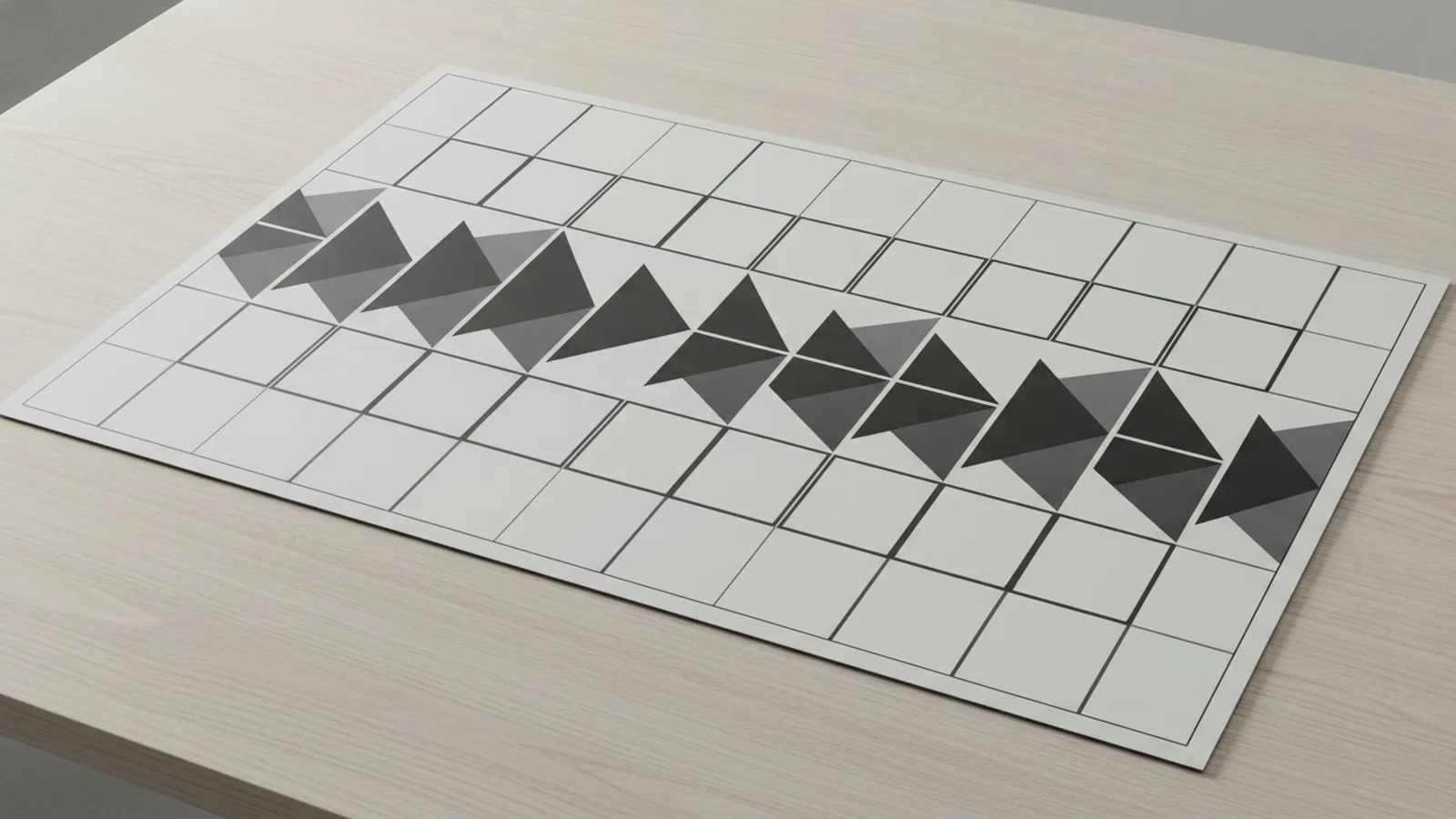
Rhythm in graphic design is the repetition of elements to create a sense of movement across a layout. Instead of static placement, you repeat shapes, colors, lines, spacing, or text sizes in a pattern. That repetition helps the viewer feel pacing, flow, and direction. In other words, it turns visual composition into an experience.
Designers often use rhythm alongside balance in design. Balance decides how weight is distributed. Rhythm decides how the eye travels from one area to the next. When they work together, the page feels planned, not random.
- Repetition: same or closely related elements repeat.
- Interval: spacing between repeats stays consistent or varies on purpose.
- Movement: the viewer’s eye “keeps going” through the pattern.
If you are asking “what is rhythm in graphic design,” think of it like a beat in music. The beat can be steady, can flip between two states, or can appear in bursts.
Why rhythm matters in design
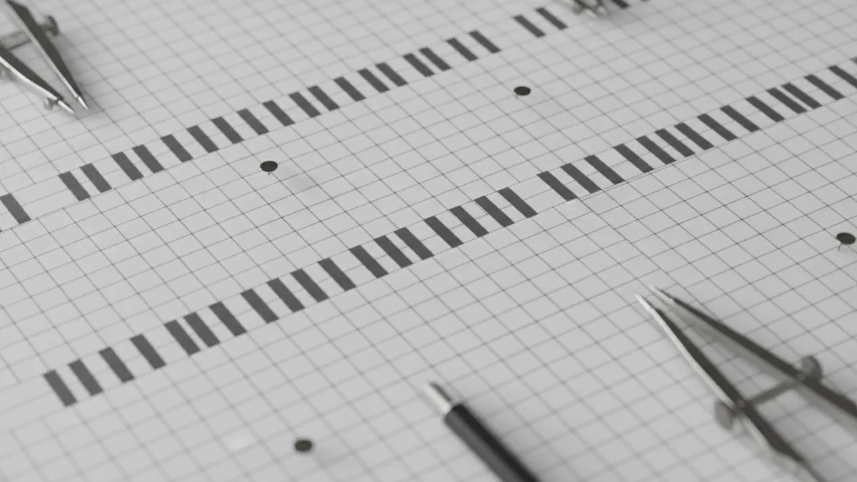
The importance of rhythm in design shows up in both looks and usability. Visually, repetition can improve aesthetic quality by making elements feel connected. It also helps establish a clear hierarchy without relying only on size or contrast. A rhythmic layout often feels “clean” even when it is expressive.
Rhythm also guides the viewer’s eye through the composition. Instead of scanning everything at once, people follow the repeated cues. This matters in design work where attention is limited, like landing pages, hero sections, and product cards. When the eye path is predictable, users find information faster.
Rhythm in visual media can also affect emotion. Regular spacing often feels calm and orderly. Alternating rhythm can feel active or playful. Random rhythm can feel energetic or experimental when controlled. These emotional tones can influence how users perceive a brand.
Finally, rhythm supports a more organized and cohesive design. Many design principles fail when elements share no relationship. Rhythm gives that relationship, so multiple sections can feel like one system rather than separate blocks.
- Aesthetic: repetition makes layouts feel intentional.
- Guidance: consistent cues create a viewing path.
- Emotion: pattern pacing shapes perception.
- Coherence: sections feel connected through shared structure.
Three core types of rhythm: regular, alternating, and random
Not all rhythm is created equal. The type of repetition and the intervals between repeats change the effect. Here are three common graphic design rhythm types and what they tend to do to the viewer.
Regular rhythm
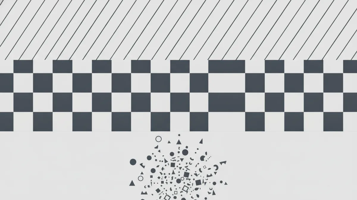
Regular rhythm uses the same element at steady intervals. You might repeat icons every 8px, cards every row, or stripes with equal width. This tends to create a sense of stability and order. It also works well for grids, step-by-step flows, and product catalogs.
A good quick test is to cover the page and then imagine where the repeated elements would land. If your mental map feels predictable, you likely have regular rhythm.
Alternating rhythm
Alternating rhythm repeats between two or more variations. For example, you alternate color tones, icon styles, or text sizes: primary, neutral, primary, neutral. This creates movement because the eye is tracking change. It can feel energetic without losing structure.
Alternating rhythm is also useful when you want clear separation between items. A list with alternating backgrounds is a common pattern for readability. The rhythm becomes a supporting design principle rather than decoration.
Random rhythm
Random rhythm uses variation with less predictable intervals. The key is that “random” is still controlled. You might cluster elements in bursts, vary rotation slightly, or vary spacing while keeping an overall system. Done well, it feels spontaneous and dynamic.
Random rhythm can work in editorial spreads, posters, and certain marketing creatives. But the danger is chaos. If every interval changes with no constraints, the layout stops guiding the eye.
| Rhythm type | How it repeats | Typical effect | Best use |
|---|---|---|---|
| Regular | Same element, steady spacing | Calm, orderly, predictable | Grids, lists, catalogs |
| Alternating | Two states swap repeatedly | Active, readable, balanced | Feeds, comparisons, sections |
| Random (controlled) | Variable spacing and size, with rules | Energetic, expressive | Posters, hero graphics |
How to create rhythm in your designs
Rhythm becomes easy when you treat it like a system, not decoration. Start by choosing what repeats. Then define how often it repeats. Finally, decide how the intervals should behave across the page.
One practical approach is to pick a single “rhythm unit.” This could be a spacing step like 8px, a column width, or a baseline grid. Once you pick the unit, you repeat it across sections. That alone creates a strong baseline of visual composition.
- Choose the repeated element. Pick one primary cue such as spacing, headings, icons, or card frames.
- Set consistent intervals first. Place the first three repeats with equal spacing. This builds the underlying beat.
- Decide where to add variation. Use alternating states or a controlled “random” burst near focal points.
- Use rhythm to move the eye. Place stronger repeats near the start of a reading path, then soften them after.
- Check spacing and alignment. If items look off-grid, the rhythm breaks. Fix alignment before fine-tuning colors.
- Test at two zoom levels. Look at 100% and 200%. Rhythm that is clear at both is usually robust.
Another concrete method is to map your viewing path. Draw a simple arrow sequence: where does a user look after scanning the headline? If your repeats sit along that path, rhythm will feel natural. If they fight the path, they will feel noisy.
For user experience in design, remember that rhythm interacts with content density. If line height is too tight, your “text rhythm” becomes unreadable. A common readability baseline is a line height around 140% to 160% for body copy. Adjust from there, but treat line height as your interval.
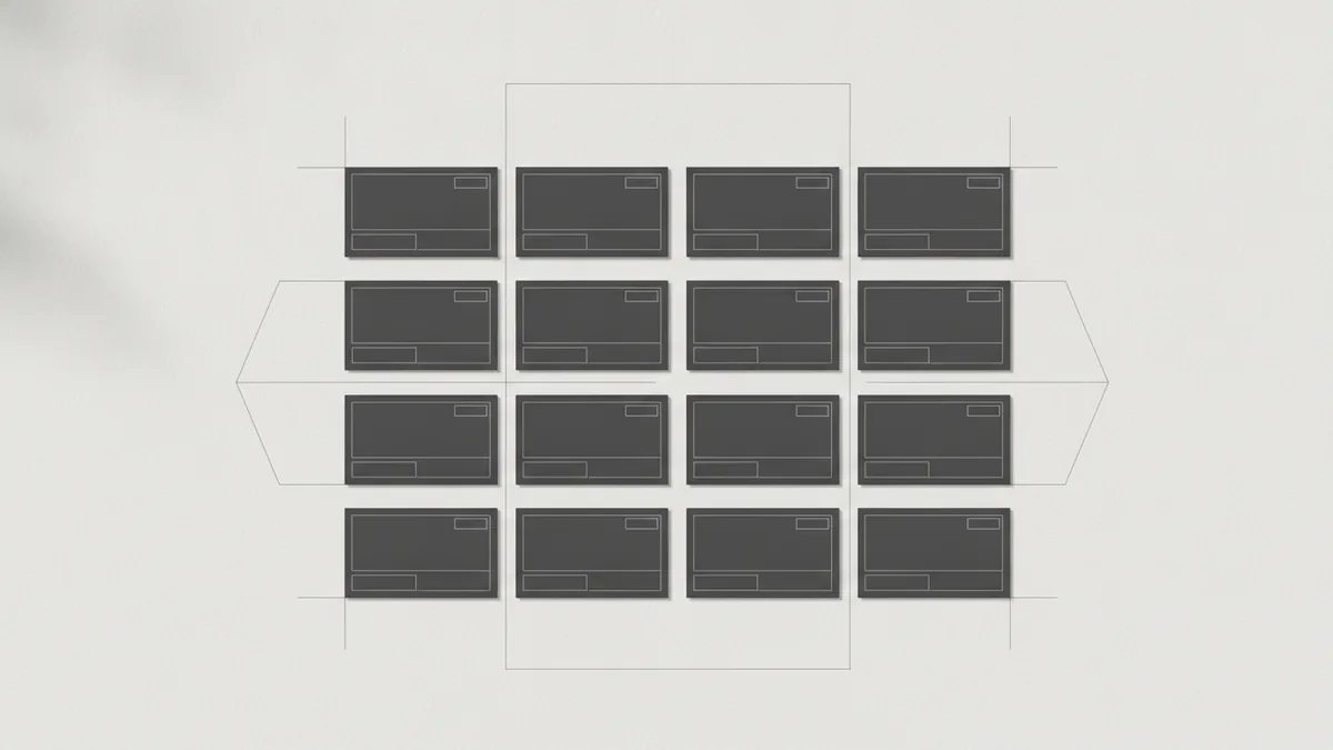
When you are designing a UI, rhythm can align with components. For example, cards in a catalog can share identical padding and corner radius. Even if content changes, the repeated frame becomes a visual tempo.
Examples of rhythm in graphic design
Rhythm shows up in many everyday design patterns. Here are a few examples you can study and reuse with intent.
Feature blocks on a landing page
Imagine three feature cards stacked vertically. If each card repeats an icon size, title style, and vertical spacing, the layout gains regular rhythm. Even if the text differs, the viewer reads with a steady beat. You can add alternating rhythm by swapping background shade on every other card.
Editorial headlines and subheads
In magazines or blog headers, rhythm often comes from typographic repetition. The same heading style repeated across sections creates regular rhythm. A changing level, like H2 then H3, can create alternating rhythm. The pause between sections becomes part of the movement.
Icon rows and button bars
A row of small icons can create strong rhythm if their size, stroke weight, and spacing are consistent. In dashboards, this helps scan fast. If every third icon is highlighted, you get alternating rhythm that points attention to key actions.
Posters with controlled randomness
Posters often use random rhythm by varying the placement of elements. A designer might use the same three shapes but change rotation and spacing in bursts. The repetition of the shapes keeps the system coherent, while the spacing creates energy. This is “random” in interval, not in identity.
- Regular rhythm: equal spacing of cards or icons.
- Alternating rhythm: every other item changes color or weight.
- Random rhythm: same elements, varied intervals within constraints.
Common mistakes to avoid with rhythm
Rhythm fails in predictable ways. Most issues come from using repetition without control, or from trying too hard to make everything “match.” Keep an eye on these common mistakes.
Overusing rhythm
If you repeat too many elements at once, the page can feel busy. The viewer then has too many beats to follow. Instead, choose one or two dominant rhythm cues. Let secondary elements support them rather than compete.
Underusing rhythm
If nothing repeats clearly, the viewer has no rhythm to follow. The design can feel flat, especially when contrast and sizes are also inconsistent. Add a repeatable unit such as spacing steps, card frames, or a repeated header style.
Breaking the interval rules accidentally
Rhythm depends on intervals. If spacing shifts randomly because of manual tweaks, the beat becomes uneven. This is common when designers adjust padding by eye in late stages. Use a spacing scale and grid to keep intervals stable.
Using random rhythm with no constraints
Random rhythm needs guardrails. If every element changes size, rotation, and position without shared rules, the result reads as chaos. For controlled randomness, keep repeated identity elements the same, like a limited set of shapes or a fixed color palette.
Confusing rhythm with hierarchy
Rhythm is about movement through repetition. Hierarchy is about importance through contrast and size. If everything is the same size and only repeated, users may miss the main message. If everything is different and none repeat, rhythm cannot guide the eye.
| Mistake | What it looks like | Fix |
|---|---|---|
| Overuse | Too many repeating cues | Pick one dominant rhythm cue |
| Underuse | Scattered elements | Repeat spacing or components |
| Interval drift | Spacing feels uneven | Use a spacing scale |
| Uncontrolled randomness | Items feel noisy | Limit shapes and palette |
When you avoid these traps, graphic design rhythm becomes a tool for clarity. Your layouts will feel more organized and more cohesive. The viewer will move through the design with less effort.
Frequently asked questions
- What is rhythm in graphic design?
- Rhythm in graphic design is the repetition of elements to create movement. It helps the viewer follow a pattern through the layout.
- Why is rhythm important in design?
- Rhythm improves visual cohesion and can guide attention through a clear viewing path. It also supports user experience by making scanning easier.
- What are the main types of rhythm in graphic design?
- Common types are regular rhythm, alternating rhythm, and random rhythm. Each type creates a different feel through repetition and interval control.
- How do I create rhythm in my designs?
- Choose what repeats, set consistent intervals, then add controlled variation. Use grids or a spacing scale to keep the beat steady.
- What mistakes should I avoid when using rhythm?
- Avoid overusing repeated cues, which can feel busy. Also avoid underusing repetition, which makes layouts feel disconnected.
- Can rhythm affect emotion in visual design?
- Yes. Regular rhythm often feels calm, alternating rhythm can feel energetic, and controlled random rhythm can feel playful or experimental.
Related reading

Is Ecommerce Growing, and Why Does It Matter?
Learn what drives ecommerce growth and where online stores can stumble.

What Is a Headless API, and How Does It Power eCommerce?
See how headless APIs link flexible storefronts with eCommerce back ends.

What Does SaaS Stand For in Business?
Learn what SaaS means, how it works, and why businesses use it.