What Is Shape in Graphic Design? Meaning & Types
Learn what shape in graphic design means, the main types of shapes, and how shape psychology guides visual communication.
Understanding shapes in design
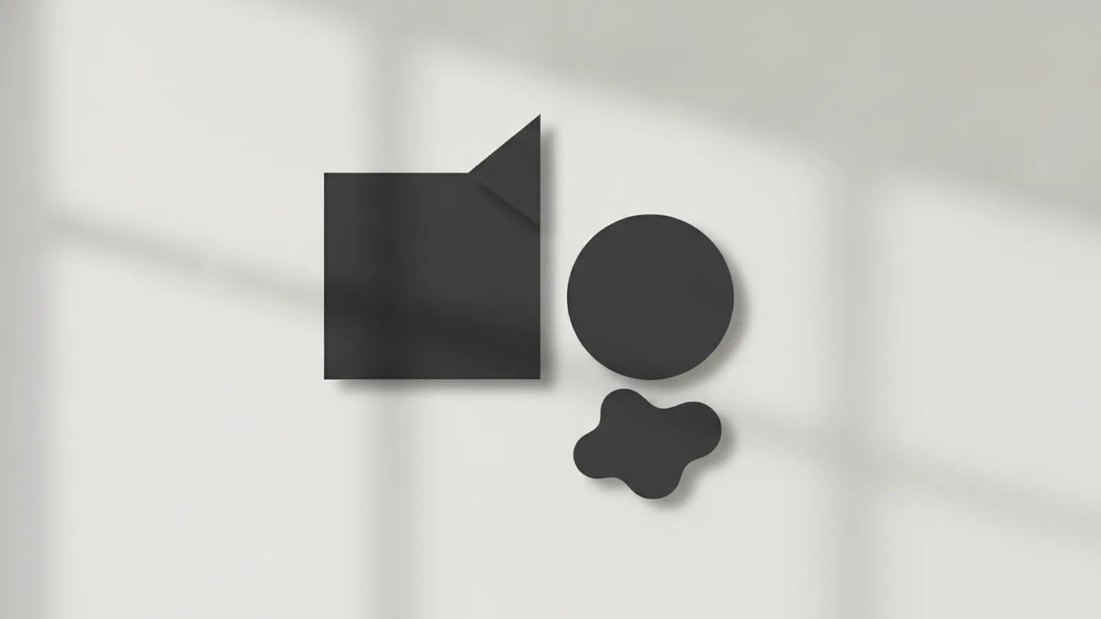
What is shape in graphic design? A shape is a defined area with clear boundaries that creates form in a two-dimensional space. In practice, shapes act like design elements that help a graphic communicate both meaning and mood. They also guide how people scan a layout.
Shape is one of the first visual building blocks a viewer notices. It is why posters, icons, and UI screens feel readable even when text is small. Strong shape choices improve visual hierarchy and make messages easier to grasp.
Designers rarely use shapes alone. They combine shape with color, spacing, and typography to build visual communication. When those pieces work together, the viewer feels a clear story.
- Message support: Shapes can imply function, focus, or direction.
- Emotion support: Shapes can suggest calm, energy, or stability.
- Navigation support: Shapes help direct attention across a layout.
Types of shapes in graphic design
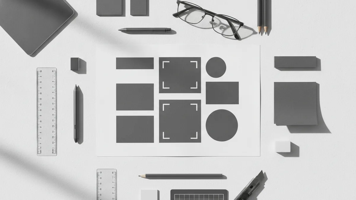
When people ask about types of shapes in graphic design, they usually mean how shapes are built and how they behave visually. A common way to classify them is by how regular they are, and whether they resemble real-world forms. Another helpful lens is whether they feel abstract or literal.
Geometric shapes come from math-like rules. They are usually crisp and predictable, which makes them strong for structure. Organic shapes are less strict and often feel more alive.
You will also see abstract vs. non-abstract categories. Abstract shapes do not copy a specific object, so their meaning depends more on context. Non-abstract shapes resemble something real, so viewers often attach faster, more literal interpretations.
| Shape type | How it looks | Typical design role |
|---|---|---|
| Geometric | Regular edges, clear angles, tidy proportions | Grid layouts, buttons, badges, icons |
| Organic | Irregular edges, natural curves, uneven spacing | Illustration accents, brand texture, motion cues |
| Abstract | Form without a clear real-world source | Concept visuals, style direction, mood building |
| Non-abstract | Form that resembles an object or scene | Storytelling, clarity for what it represents |
Geometric vs. organic shapes
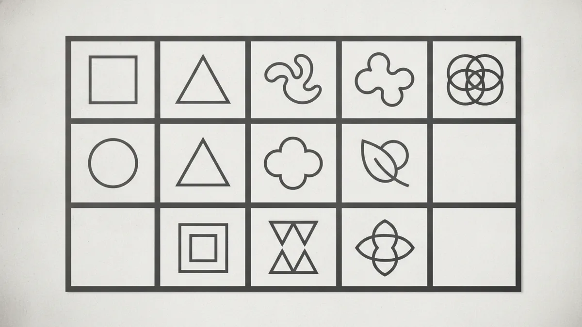
Geometric shapes are built with predictable rules. They include simple forms like squares, circles, and triangles. Designers often use geometric shapes because they fit neatly into systems for alignment and spacing.
Compound geometric shapes combine simple ones into new silhouettes. Think of a shield shape made from a triangle top and a rectangle base, or a star-like badge made from repeated triangles. These compound forms can carry clear identity in logos and UI components.
Organic shapes are more natural and irregular. They often feel imperfect in a human way, with flowing edges and uneven curves. That quality makes them useful for communicating freedom, softness, and movement.
Here is a practical way to choose between them. Use geometric shapes when you need order and clarity. Use organic shapes when you need energy, friendliness, or motion.
- Squares and rectangles: Structure, stability, boundaries.
- Circles and ovals: Unity, continuity, protection, wholeness.
- Triangles: Direction, action, tension, growth.
- Blobs and waves: Flexibility, play, movement, spontaneity.
The meaning of shapes in visual communication
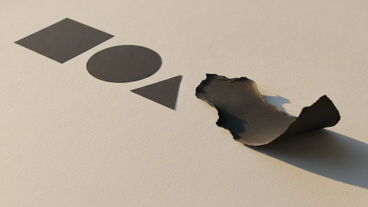
Shape meaning in design comes from how viewers interpret form. It is not only about the shape itself, but also about size, placement, color, and context. A circle can feel calm in a wellness poster, but it can also feel tense when it is small and isolated.
This is why shape language matters. Shape language is the set of visual rules your design uses, such as which shapes you repeat, how you combine them, and what you emphasize. When your shape language is consistent, viewers learn what your design “means.”
Symbols in design also play a role. A triangle can suggest “warning” when combined with sharp contrast and careful framing. A rounded rectangle can suggest safety when used for a friendly button area.
Abstract shapes add another layer. Since they do not point to a single object, they often rely on composition to guide interpretation. For example, a cluster of small circles can feel like community, while a lone large circle can feel like focus.
| Shape | Common meaning cues | Design lever to reinforce it |
|---|---|---|
| Square | Balance, rules, reliability | Use straight edges and even spacing |
| Circle | Connection, calm, completeness | Use soft color and generous padding |
| Triangle | Speed, direction, hierarchy | Point edges toward the key message |
| Irregular blob | Energy, freedom, change | Let edges overlap and avoid rigid grids |
Shape psychology in design
Shape psychology refers to the emotional and psychological impact shapes can create. People do not experience shapes as pure geometry. They experience them through learned patterns, cultural signals, and the way forms compare to each other in a layout.
Many designers notice that angular shapes tend to feel more intense. Sharp corners can feel like they are “pointing” or creating pressure. That effect is stronger when contrast is high and spacing is tight.
Curved shapes tend to feel more gentle. Smooth edges often read as safer and easier to engage with. This does not mean circles are always calm, but they usually require less visual tension to feel approachable.
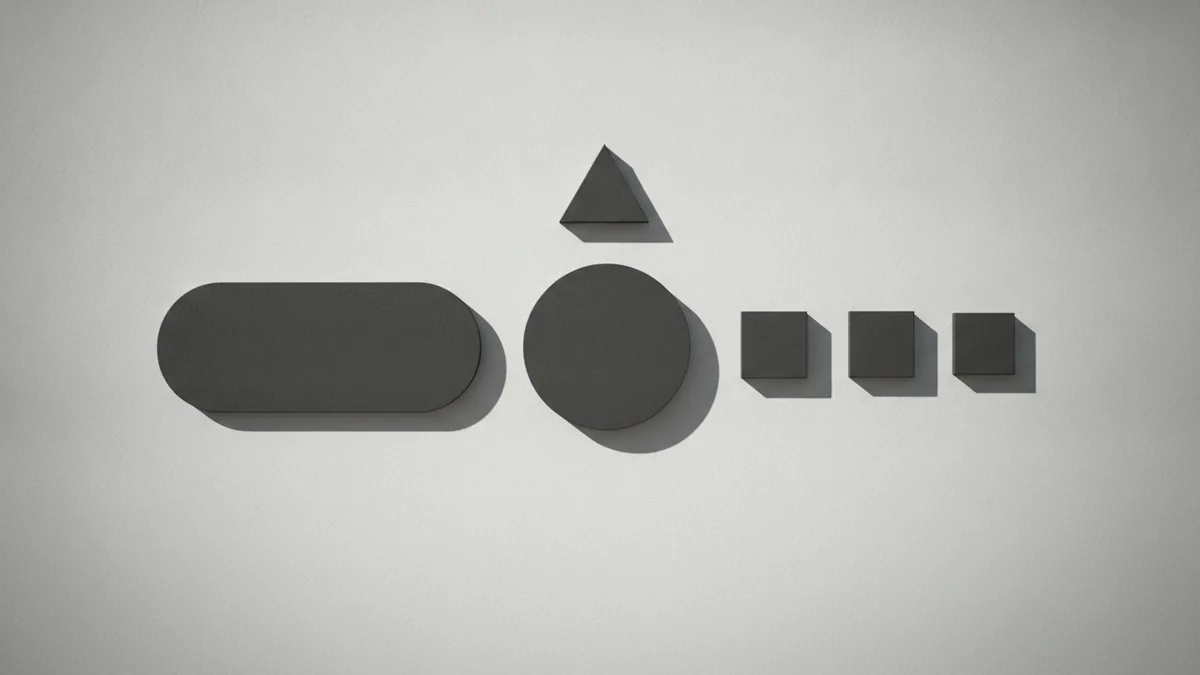
A key takeaway is that psychological impact is relative. A triangle among circles can feel more energetic because it stands out. A circle inside a grid can feel calmer because it counters the straight structure.
- Set the baseline: Pick one main shape family for the layout.
- Use contrast: Add a different shape only where you want attention.
- Match intent: Align shape emotion with the message, not with trends.
- Test with scale: Zoom out to see if the emotional tone still holds.
To validate your assumptions, compare two versions of the same layout. Keep text the same. Change only the shape set. If users react differently, you have evidence for shape psychology in your specific context.
Using shapes effectively in real designs
Uses of shapes in design go far beyond decoration. Shapes can create sections, emphasize calls to action, and organize content into a clear visual hierarchy. They can also add rhythm through repetition and variation.
A strong approach is to treat shapes like a layout system. Decide which shape will represent structure, which will represent emphasis, and which will represent decoration. Then apply those roles consistently across the design.
Combining different shapes effectively is crucial for creating a design that feels appealing and communicates clear messages. The trick is controlling overlap and hierarchy. If every element competes, viewers stop trusting the visual order.
Here are concrete ways to combine shapes without making the design feel random.
- Pair geometry with organic accents: Use a geometric grid, then add organic blobs as highlights.
- Use one main silhouette: Repeat the same base shape for section headers or cards.
- Reserve sharp shapes for key points: Triangles can point to the primary action.
- Keep edges readable: Avoid tiny shapes with thin strokes that disappear at small sizes.
For icons, shapes are even more direct. A simple square icon can feel like a container or feature. A circular icon often feels like a status or action hub. If you design a set, match visual weight and corner style across all icons.
For branding, build a shape language guide. Pick 3 to 5 shapes, define how they scale, and set rules for which shapes appear in which contexts. This helps your team keep consistent design elements across posters, slides, and web pages.
Conclusion: why shapes matter
Shapes are fundamental elements in graphic design. They help convey messages and emotions using only form and space. That is why shape appears in everything from icons to full brand systems.
Understanding types of shapes in graphic design gives you a toolkit for structure. Geometric shapes bring clear order and often support stability. Organic shapes add movement and human warmth.
Finally, shape psychology in design helps you choose forms that match your intent. When you combine shapes with care, you strengthen visual communication and improve visual hierarchy. The result is a design that looks good and tells a story clearly.
Frequently asked questions
- What is shape in graphic design?
- A shape is a bounded area that creates form on a flat design surface. It helps viewers understand structure, focus, and mood through visual cues.
- What are the main types of shapes in graphic design?
- Common types include geometric and organic shapes. Designers also classify shapes as abstract or non-abstract based on how literal they feel.
- How do geometric shapes like circles and triangles convey meaning?
- Squares often suggest stability, circles suggest unity, and triangles suggest direction or action. Meaning changes with how you scale and place them in the layout.
- What is shape psychology in design?
- Shape psychology is the emotional and mental impact shapes can create. It is influenced by visual tension, cultural cues, and how shapes contrast in context.
- How do you use shapes effectively in design layouts?
- Give shapes roles such as structure, emphasis, or decoration. Keep one main shape family for consistency, then use contrast only where you need attention.
- What is shape language in visual communication?
- Shape language is the repeatable set of shape rules a design uses. It creates consistency so viewers learn what your shapes represent.
Related reading

Is Ecommerce Growing, and Why Does It Matter?
Learn what drives ecommerce growth and where online stores can stumble.

What Is a Headless API, and How Does It Power eCommerce?
See how headless APIs link flexible storefronts with eCommerce back ends.

What Does SaaS Stand For in Business?
Learn what SaaS means, how it works, and why businesses use it.