What Is a Hero in Web Design? Examples, Best Practices
Learn what a hero in web design is, why hero images boost UX and conversions, key components, types, best practices, and A/B testing tips.

What a “hero” means in web design
A hero is the top, most noticeable section of a webpage. It is usually visible right away, without the user needing to scroll.
If you search “what is a hero in web design,” you will usually see the same idea. A hero sets the tone, explains what the site offers, and guides the next step.
In practice, this is often a hero image in web design paired with clear text. Together, they communicate the value proposition and shape first impressions.
- Prominent placement near the top
- Strong visual focus
- Fast clarity about the offer
- Direct path to action
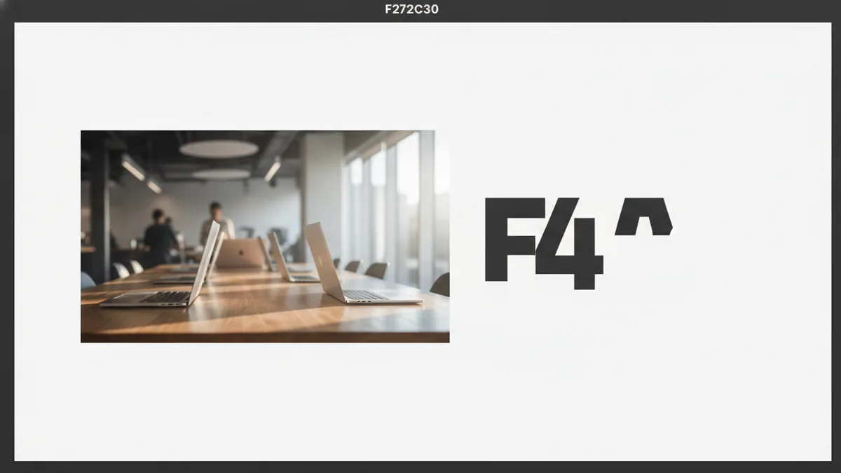
Why hero images matter for user experience and conversions
Hero images can strongly affect user experience (UX) because they decide whether people keep reading. When the hero matches user intent, visitors feel “this is for me.”
That feeling matters for conversion, too. A good hero reduces confusion, so users reach your call-to-action (CTA) sooner.
They also act like a visual summary of your brand. For example, a fintech landing page might use clean product visuals to signal trust and clarity.
The best hero image in web design does not just look good. It supports navigation by telling users what they can do next.
Key components of a hero section
A complete hero section usually has four parts. If one part is weak, the whole section feels off.
Start with a headline that states the core offer in plain language. Then add a subheading that adds context or a quick proof point.
Next comes a single, clear CTA. One primary CTA beats a crowded set of buttons in most cases, because it reduces choice load.
Finally, include engaging visuals. The visual should reinforce the value proposition, not compete with it.
| Component | What it should do | Common mistake |
|---|---|---|
| Headline | State the main benefit fast | Using vague branding only |
| Subheading | Clarify the “for whom” and “why” | Long paragraphs that hide meaning |
| CTA | Give one next step | Multiple competing buttons |
| Visual | Support the promise and brand | Generic stock that feels unrelated |

Types of hero images you can use
When people ask “what is a hero image in web design,” they usually mean the visual component that anchors the hero. It can be a photo, video, or illustration.
Different types fit different products and audiences. The key is matching the visual to what users need to understand first.
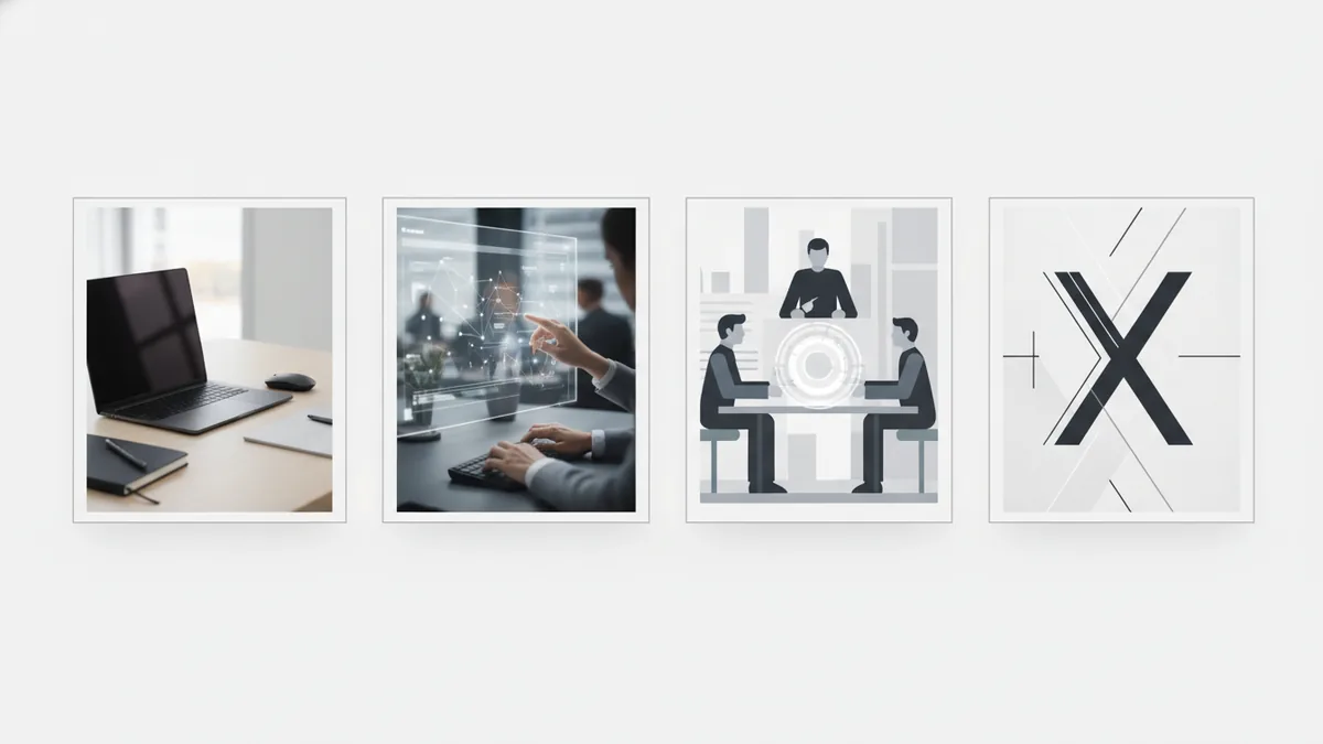
- Product photography: Clean shots of the item or workspace. This works well when the product is the main reason to convert.
- Sizzle reels (short videos): 5 to 15 seconds of motion that shows outcomes. This helps if your product is hard to explain in a single frame.
- Typography-focused images: Text-led visuals like bold headlines on design backgrounds. These are useful for campaigns where messaging is the hero.
- Illustrations and diagrams: Simple visuals that explain how something works. This can speed understanding for complex tools.
In all cases, your hero image should align with branding. If your brand is minimalist, a busy visual can hurt engagement metrics.
Best practices for designing a hero section
Design is not only about looks. A hero section is a conversion tool, so structure and clarity matter.
First, prioritize benefits over features. A benefit tells users what changes for them. A feature tells what the product includes.
Second, use one clear CTA. If you want users to watch a demo, make the button “Watch demo,” not “Watch” plus “Learn” plus “Contact.”
Third, build strong visual hierarchy. The headline should be the biggest text, then the subheading, then the CTA. Keep the image secondary unless your product is inherently visual.
Fourth, optimize load time. Heavy hero media can hurt page load speed and make the hero feel broken. Use compressed images, modern formats like WebP or AVIF, and avoid large autoplay videos.
- Write the headline for scanning: aim for one clear promise in under 10 words.
- Support it with a subheading: add a reason to believe or a narrow audience fit.
- Design for one action: choose a primary CTA and remove distractions.
- Measure media weight: keep hero images lightweight enough for fast first render.
As a practical benchmark, consider targeting a hero section that renders quickly on mobile. If users see blank space for more than a second, drop-offs often rise.
Examples of effective hero images and what makes them work
Effective hero images usually share three traits. They match the promise, show the outcome, and guide the eye toward the CTA.
Example one: a SaaS dashboard hero often uses a clean screenshot or an illustration. The UI is shown with enough context to understand value, while still leaving space for the headline.
Example two: an ecommerce hero uses product photography with a lifestyle angle. The photo demonstrates quality, and the headline connects that quality to a clear reason to buy now.
Example three: a platform hero uses a short video loop. Motion shows what the tool does, while the text and CTA keep the message grounded.
In every case, the hero image in web design works with the copy. If the image is great but the headline is unclear, conversions usually stall.
Testing and optimizing hero images with A/B testing
Once you have a working hero section, you can improve it systematically. Regular A/B testing helps you find which hero images and elements perform best.
Start by choosing one variable to test at a time. For instance, test two hero images with the same headline and CTA. Then keep the winner as your baseline.
Next, decide what success means. Track primary engagement metrics like click-through to the next section, signup starts, or checkout starts. Pair those with drop-off rate on mobile to catch speed issues.
Then run the test long enough to make noise less likely. A/B testing is not a “run for a day” exercise. Aim for a stable sample size, and avoid major traffic changes during the test window.
Here are good test ideas that usually move the needle:
- Different hero image types (photo vs illustration) with the same copy
- CTA button placement (below the fold vs near the hero)
- Headline wording that emphasizes outcome instead of features
- Video hero vs static hero for the same value proposition
- Layout variations that improve visual hierarchy
Finally, keep the winning version but continue to refine. Small tweaks to crop, brightness, and spacing can improve readability and interaction without a full redesign.
Frequently asked questions
- What is a hero in web design?
- A hero is the prominent top section of a webpage. It is typically visible without scrolling and sets expectations fast.
- What is a hero image in web design?
- A hero image in web design is the main visual shown in the hero area. It can be a photo, video, or illustration that supports the message.
- What makes a hero section convert better?
- A clear headline, a focused call-to-action, and a visual that matches the value proposition. When visitors understand the offer quickly, clicks and signups rise.
- How do hero images affect user experience?
- They shape first impressions and reduce confusion. A relevant hero image helps users decide whether to stay and take action.
- How should I test hero images?
- Run A/B testing with one change at a time, like the hero image type or crop. Track click-through and conversion signals, and test long enough for stable results.
- Do hero images slow down page load speed?
- They can, especially if media files are large. Use compressed images and modern formats, and limit heavy video on mobile.
Related reading

Is Ecommerce Growing, and Why Does It Matter?
Learn what drives ecommerce growth and where online stores can stumble.

What Is a Headless API, and How Does It Power eCommerce?
See how headless APIs link flexible storefronts with eCommerce back ends.

What Does SaaS Stand For in Business?
Learn what SaaS means, how it works, and why businesses use it.