X-Height in Graphic Design: Definition, Role & Readability
Learn what x-height is in graphic design, why it matters for legibility and balance, how it varies by typeface, and how to measure it.
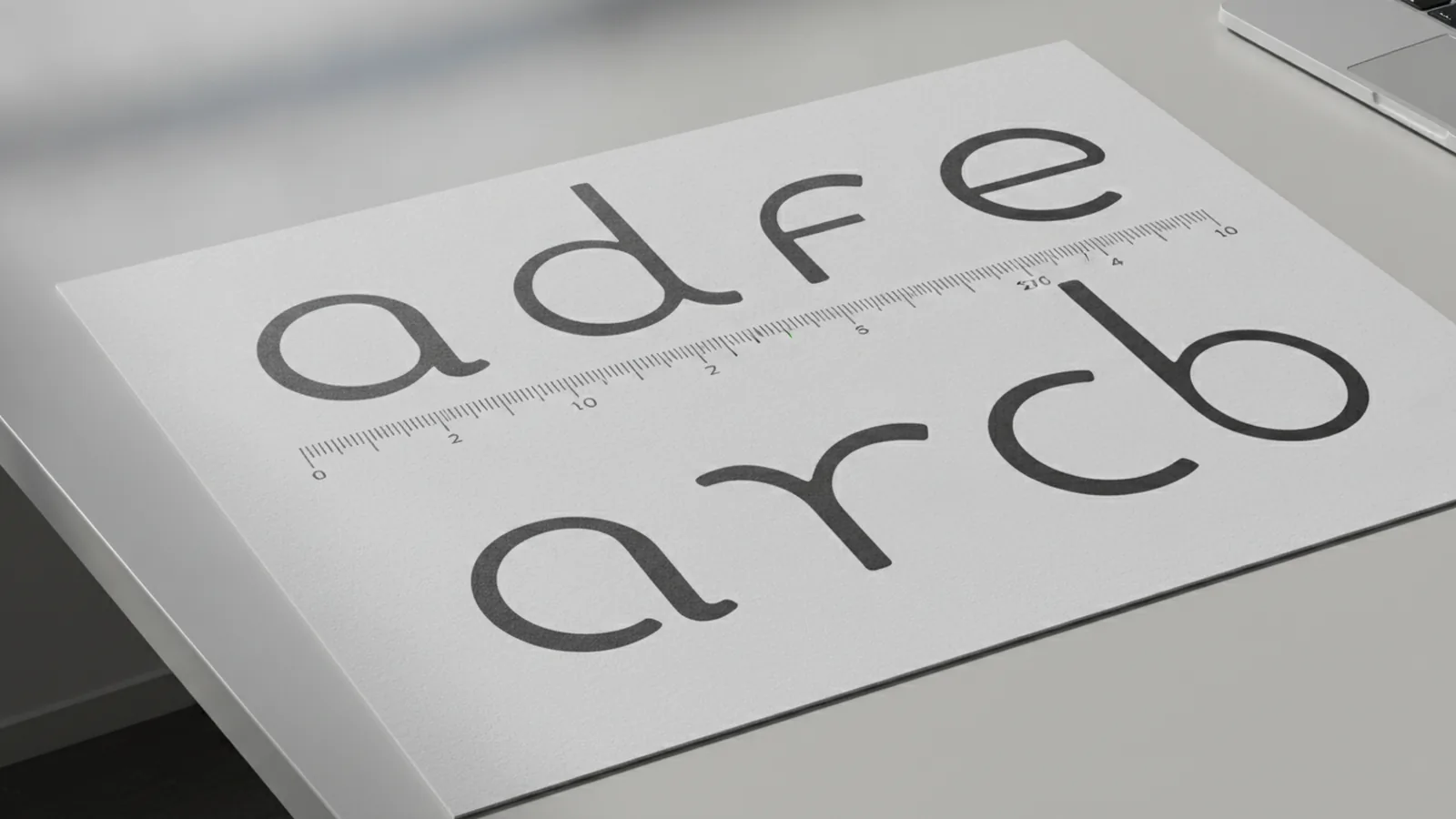
What x-height is in graphic design
X-height is the height of lowercase letters, measured from the baseline to the mean line. In most fonts, the mean line is where letters like a, e, and n reach their top. This makes x-height a core part of the x height definition people use when comparing typefaces.
In practice, x-height is one number that strongly affects the “feel” of a font. A taller x-height usually means more inked area in body text. That can change spacing needs, line length choices, and even how quickly readers scan a page.
It is also useful because x-height sits inside the typographic design system of other vertical metrics. For example, the baseline anchors alignment, ascenders rise above it, and descenders fall below it. Cap height is the height of uppercase letters, and it can vary independently from x-height.
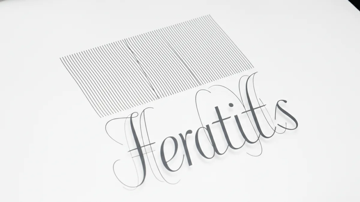
Why x-height matters for typography
The importance of x height is that it helps you judge visual balance between lowercase and uppercase. When uppercase letters are the same size, a larger x-height can make text look denser and more “open” at reading distance. When x-height is small, lowercase forms shrink, and the set can feel lighter or thinner.
X height typography also affects how readers perceive rhythm. Many lines are mostly lowercase in typical paragraphs. If those lowercase shapes have more vertical presence, the lines can feel steadier and easier to track.
Most importantly, x height and readability are linked. At small font size, the details inside lowercase letters get harder to see. Letters like c or e lose contrast first. A larger x-height tends to keep those forms more recognizable, so readers can decode faster without “guessing.”
- Large x-height: often improves legibility in body text, especially on screens.
- Small x-height: can still look elegant, but it may need larger type sizes.
- Consistent x-height across a set: supports predictable line texture.
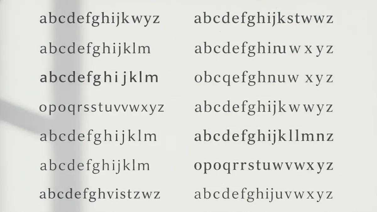
How x-height varies across different typefaces
Different typefaces can have different x-heights even when they are set to the same point size. Point size tells you the size of the font’s design box, not how tall the lowercase forms are. So two fonts both set to 12 pt can have very different lowercase presence.
Consider two common styles. Many “modern” sans serif families often aim for a relatively larger x-height to keep text clear. Some high-contrast serif designs can have lower x-heights, which gives a more formal look. Both can be readable, but their readability tradeoffs differ.
Even within the same style, designers tune the vertical metrics to match the overall design goals. That is why you may notice that one font looks “bigger” at the same size. The reason is often x-height, not just stroke thickness or letter spacing.
| Typeface style | Typical x-height feel | Common readability impact |
|---|---|---|
| Humanist sans | Often medium to large | Good body text clarity |
| Neo-grotesk sans | Can be medium to large | Neutral, steady line texture |
| High-contrast serif | Often smaller | May need more size for comfort |
| Condensed or display designs | Varies a lot | Can look striking, not always ideal for long reading |
Practical applications of x-height in real design work
Understanding x-height helps you pick fonts for the job, not just for aesthetics. If you are setting body text for a dashboard, a blog, or a help center, legibility under imperfect conditions matters. Those conditions include small sizes, low contrast, and frequent scanning.
For body text, larger x-heights usually make lowercase letters easier to recognize quickly. That can reduce the effort readers spend decoding shapes. For design, it also creates a different texture per line, which affects how dense the page feels.
For display typefaces, smaller or stylized x-heights can be intentional. Designers may want tight, elegant forms with clear hierarchy. The key is to match the font’s vertical tone to the viewing distance and the expected reading duration.
- Body text: choose fonts whose x-height supports the target size.
- UI labels: prioritize x-height when size is constrained.
- Headlines: use x-height to control perceived weight.
- Mixed type systems: match x-height feel across styles for harmony.
You can also use x-height knowledge to anticipate spacing needs. Fonts with larger x-heights often look better with slightly tighter line heights. Fonts with smaller x-heights sometimes need more line spacing to prevent the text from feeling cramped.
How to determine the x-height of a font
You can estimate x-height visually, but you will get better results by measuring it. The most direct method is to check the font’s vertical metrics in a font tool or design software. Many tools can show the baseline and the mean line so you can measure the distance.
A practical approach is to compare lowercase letter heights using a controlled test. Set the font at a known point size, then measure the actual pixel distance from the baseline to the top of letters that define x-height. Letters like x, n, and e are often good references because they align well with the mean line.
When you compare fonts, control for these variables. Use the same font size, the same rendering mode, and the same display settings. Also compare at the sizes you truly use. X-height feels different at 14 pt than it does at 10 pt, even with the same font.
- Pick a font size you expect for body text.
- Render a sample string with clear lowercase shapes.
- Measure from the baseline to the mean line for the lowercase forms.
- Repeat for a second font, using the same measurement method.
- Compare how the lowercase area reads at your real viewing distance.
If you cannot measure directly, you can still do useful checks. Place two fonts side-by-side in a short paragraph. Then look at how quickly your eye tracks the lines. The font with clearer lowercase presence at the same point size often has the larger effective x-height.
Best practices for using x-height in typography
Start by aligning x-height with your readability target. If readers will view text on small screens, prioritize fonts that maintain clear lowercase forms. Fonts with larger x-heights generally perform better in body text because lowercase shapes stay more legible when details shrink.
Next, use x-height to guide type pairing decisions. When mixing uppercase headers with body copy, you want a balanced hierarchy. If your body font has a small x-height, you may need a slightly larger size or stronger weight for balance. If it has a large x-height, you can often keep the header more restrained.
Also account for legibility context, not just the number. Contrast, line length, and line height all affect readability. But x-height is a “base layer” metric that changes how those other choices feel. It helps explain why two fonts at the same point size do not produce the same reading experience.
- Choose x-height based on viewing size and reading time, not only style.
- Test at the exact font size and device you will ship.
- When pairing fonts, compare lowercase texture, not just uppercase style.
- Watch for cramped line texture when x-height is small.
Finally, remember that x-height is part of a bigger system. Ascenders, descenders, and cap height also shape the vertical rhythm of text. Still, x-height is often the quickest signal for whether a font will feel readable in paragraphs.
For most designs, the best workflow is simple. Measure or test x-height with real paragraphs. Then tune font size and line height until the text feels easy to track. With that approach, x-height becomes a practical lever, not just a definition.
Frequently asked questions
- What is x-height in graphic design?
- X-height is the height of lowercase letters from the baseline to the mean line. It tells you how tall lowercase forms look within a font.
- What is the x height definition?
- The x-height definition is the distance between the baseline and the mean line for lowercase letters. Many designers use the lowercase x as a visual reference.
- Why is x height important for typography?
- It helps assess visual balance between lowercase and uppercase. It also shapes the texture of body text across lines.
- How does x-height affect readability?
- X-height affects how easily lowercase letters are recognized, especially at small sizes. Fonts with larger x-heights often stay clearer in body text.
- Do fonts with the same point size have the same x-height?
- No. Two fonts set to the same point size can still have very different x-heights. That changes how dense and readable the text feels.
- How can I determine a font’s x-height?
- Use a font tool to read baseline and mean line metrics, or measure lowercase letter height in a controlled test. Keep the same font size and rendering settings for fair comparisons.
Related reading

Is Ecommerce Growing, and Why Does It Matter?
Learn what drives ecommerce growth and where online stores can stumble.

What Is a Headless API, and How Does It Power eCommerce?
See how headless APIs link flexible storefronts with eCommerce back ends.

What Does SaaS Stand For in Business?
Learn what SaaS means, how it works, and why businesses use it.