Typesetting in Graphic Design: Definition, Techniques & Uses
Learn what typesetting in graphic design means, why it matters, key techniques like kerning and leading, and tools for print and digital.
What is typesetting in graphic design?
Typesetting in graphic design is the practice of arranging text so it looks good and reads well. It uses typography rules to place letters, words, and lines with intentional spacing. A strong typesetting definition is not just “make it fit.” It is “make it clear, balanced, and visually consistent.”
When designers say “typesetting,” they usually mean the detailed work inside layout design. That includes how text blocks align, how much space sits between lines, and how letters relate to each other. The result supports the design’s visual hierarchy, so readers quickly find what matters.
In practice, typesetting turns raw copy into a designed system. Headlines, body text, captions, and UI labels can all follow a shared rhythm. That rhythm is what makes a graphic feel polished rather than improvised.
- Goal: improve readability and visual balance
- Method: apply typography rules to spacing and layout
- Outcome: stronger hierarchy and more confident design
A quick history of typesetting
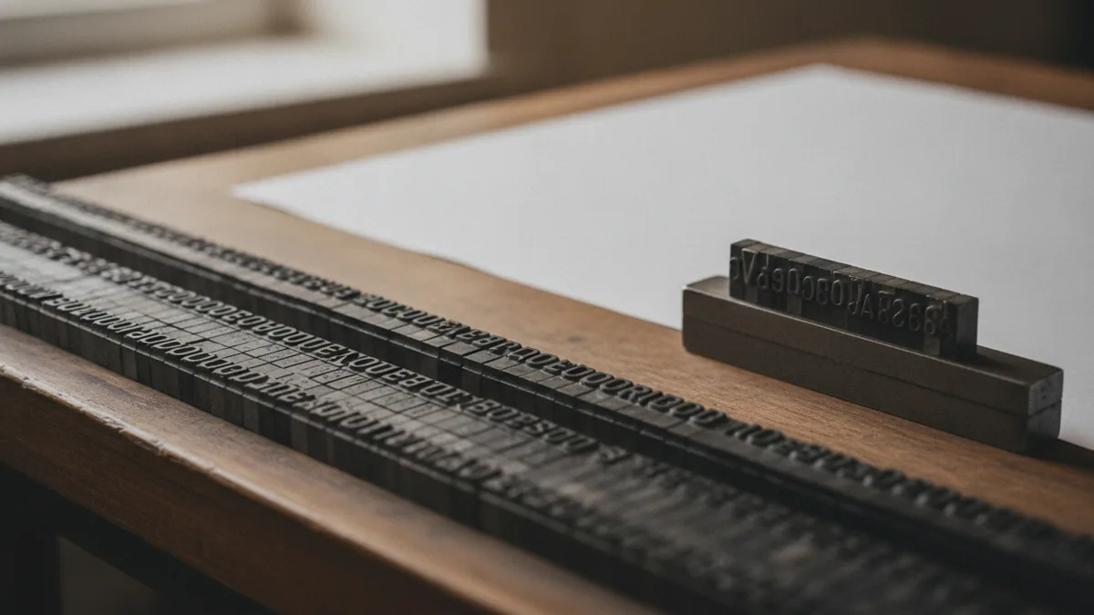
The history of typesetting goes back to the invention of print. Early printing used movable type, where letters were carved as physical pieces. Printers had to plan spacing and line lengths because each character was a real object. Those constraints helped shape the early rules of typography.
As printing spread, so did standardized approaches to composing text. Metal type made it easier to reuse letters across pages. It also pushed designers to think in terms of grids and repeatable layout patterns. Over time, that thinking evolved into modern layout principles.
Today’s digital typesetting still follows those core ideas. Digital tools let designers change spacing faster, but the goals remain the same. You still adjust alignment, line breaks, and text density for the reader. You just do it with fewer manual steps.
Why typesetting matters in graphic design
Importance of typesetting shows up immediately in the final feel of a design. Two pieces can use the same font and still look different because the spacing is handled differently. Small changes in letter spacing or line spacing can make text feel airy or cramped.
Typesetting also shapes comprehension. When line length is right and leading supports comfortable reading, people can scan and absorb information faster. When alignment is consistent, the layout looks stable and trustworthy. Even in short designs like posters, better typesetting improves clarity and impact.
It matters for branding too. Typography is a major part of a visual identity, and typesetting is the “how” behind the typography. Consistent rules across a website, brochure, and social posts make the design feel like one system. Designers often treat typesetting as part of the overall graphic design process, not an afterthought.
- Improves readability for body text and captions
- Strengthens visual hierarchy for headlines and callouts
- Creates a consistent brand rhythm across materials
- Reduces layout friction like awkward line breaks
Core typesetting techniques you’ll use in real layouts
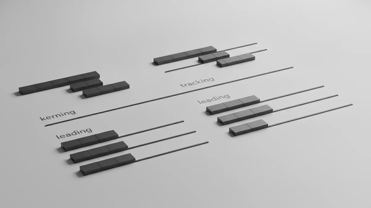
Graphic design typesetting techniques focus on how type behaves inside a layout. The big four are alignment, leading, kerning, and tracking. Each technique changes a different kind of spacing problem, so understanding the difference helps you choose the right fix.
Alignment controls how lines up to each other within a text block. Left alignment is common for paragraphs because it keeps the start of each line predictable. Center and right alignment can work for headings, but they require care to avoid uneven reading flow. Justified alignment can look dense and can create visible word gaps.
Leading is the vertical space between lines. If leading is too tight, letters from one line crowd the next. If it is too loose, the reader loses the connection between lines. For many body texts, you tune leading until the lines feel like a steady, readable “ladder.”
Kerning adjusts space between specific letter pairs. It matters most for awkward combinations like “AV” or “To.” Designers typically refine kerning when they set larger sizes, since spacing issues become obvious. Modern fonts include kerning pairs, but custom tuning still helps for logos and display type.
Tracking changes spacing across a larger range, such as a whole word or paragraph block. Tight tracking can make text feel compact, but it can also hurt readability at small sizes. Loose tracking can add elegance, but too much space can break scanning. A practical approach is to start with default font settings and adjust only when the layout demands it.
Common typesetting tools and workflows
Typesetting tools help you control spacing with precision and preview results quickly. Modern software makes it easy to adjust leading, kerning, and tracking, then test the layout at multiple sizes. You also need tools that support layout grids and consistent styles across pages.
Two common tools are Adobe InDesign and Illustrator. InDesign is strong for multi-page layouts like magazines and brochures. It supports paragraph and character styles, which helps teams keep typesetting consistent. Illustrator is often used when designs need precise control for single compositions, like posters or vector-heavy layouts.
Most workflows follow a repeatable loop. Designers set up styles for headings and body text first. They then refine spacing on key blocks that affect readability, such as hero headlines and dense paragraphs. Finally, they review the design at the intended export size to catch line-break surprises.
| Task | What to adjust | Where it matters |
|---|---|---|
| Set readable paragraphs | Leading and alignment | Body copy, captions, help text |
| Refine headline tone | Kerning and tracking | Large type, logos, display text |
| Keep layout steady | Line length and text flow | Brochures, sections, UI screens |
Typesetting in digital vs. print design
Typesetting in print and digital design share the same goals, but they behave differently. Print has fixed sizes, so designers can plan line lengths and measure final spacing with confidence. Paper texture and ink behavior can also affect how smooth text feels to the eye.
Digital design introduces motion, scaling, and different viewing distances. A layout that looks great at one screen size can wrap differently at another. That makes layout design and responsive rules more important than ever. You often rely on fluid grids, sensible font sizes, and tested line heights across breakpoints.
Font selection plays a bigger role in digital design. Some fonts render sharply, while others can look uneven at small sizes. You may need to adjust font weight, leading, or letter spacing after real device testing. The practical goal is the same: maintain visual hierarchy and readability.
In print design, you also consider production constraints like margins and trim sizes. In digital design, you consider performance and legibility in changing environments. In both cases, typesetting is the bridge between typography and layout design. It turns the same font into a designed reading experience.
Bottom line: treat typesetting as part of the design system
Typesetting is not an isolated step. It is a set of decisions that shape how readers experience your design. When you apply alignment, leading, kerning, and tracking with intent, you create a rhythm that supports comprehension. That is the real what is typesetting in graphic design answer: it is controlled text layout for clarity and beauty.
If you want faster results, build styles and rules before you fine-tune individual blocks. Use typography fundamentals, then refine where the eye notices problems first. Over time, you will develop judgment for when spacing changes improve readability versus when they distract.
Finally, keep testing. Check how text looks at the final size and under real conditions. Typesetting improves every time you learn from what went wrong in an earlier version.
Frequently asked questions
- What is typesetting in graphic design?
- Typesetting is the process of arranging text using typography rules so it looks good and reads well. It covers spacing, alignment, and line layout decisions within a design.
- What are the main typesetting techniques?
- Common techniques include alignment, leading, kerning, and tracking. Each one changes a different type of spacing for better readability and style.
- Why is typesetting important for graphic design?
- It improves legibility and makes layouts feel polished. It also supports visual hierarchy, so readers understand the message faster.
- What tools are used for modern typesetting?
- Designers often use software such as Adobe InDesign for page layouts. They also use Adobe Illustrator for precise single compositions and refined typographic artwork.
- How does typesetting differ between digital and print design?
- Print has fixed sizes, so spacing can be planned more precisely. Digital design must handle scaling and wrapping, so typesetting needs testing across screen sizes.
- Do I need typography knowledge to typeset well?
- Yes. Understanding typography helps you choose the right font selection, spacing, and layout rhythm for the content and medium.
Related reading

Is Ecommerce Growing, and Why Does It Matter?
Learn what drives ecommerce growth and where online stores can stumble.

What Is a Headless API, and How Does It Power eCommerce?
See how headless APIs link flexible storefronts with eCommerce back ends.

What Does SaaS Stand For in Business?
Learn what SaaS means, how it works, and why businesses use it.