What Is Color Theory in Graphic Design? Guide to Color & Use
Learn what color theory in graphic design is, how the color wheel works, and how to use color for harmony, psychology, branding, and accessibility.
Introduction to Color Theory
What is color theory in graphic design? It is the set of ideas that explains how colors work together. It helps you choose color combinations that feel balanced and communicate the right mood. It also gives you a way to test your choices before you ship a design.
At a practical level, what is color in graphic design? It is more than a hue name like blue or red. It includes color temperature, color values, and color saturation. Those factors change how readable, emotional, and “on brand” your design feels.
Good color work is not guessing. You can learn rules, then break them with intent. The goal is visual harmony, not color decoration.
- Use color harmony to reduce visual “noise.”
- Use contrast to keep text and UI legible.
- Use color psychology to guide emotion and attention.
- Use accessibility checks so everyone can use the design.

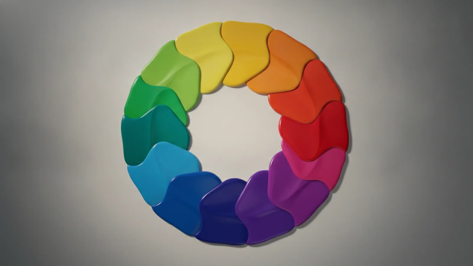
The Color Wheel Explained
The color wheel is the map for most color decisions. It organizes primary, secondary, and tertiary colors in a circle. That layout makes relationships easier to spot at a glance.
Primary colors are the starting points. In traditional theory, those are red, yellow, and blue. Secondary colors sit between them and come from mixing primaries, like green, orange, and purple.
Tertiary colors fill the gaps. They sit between a primary and a nearby secondary. This is where fine-tuning happens, because small hue shifts can change mood.
When you work digitally, remember that output systems differ. RGB and CMYK can shift the same color between screens and print. In practice, test your design in both modes when possible.
| Wheel term | What it means | How it helps you |
|---|---|---|
| Primary | Core hues | Pick a main direction for the palette |
| Secondary | Mixtures of primaries | Create supporting accents that fit |
| Tertiary | Mixtures near the gaps | Refine the “fit” of your palette |

Types of Color Harmonies
Color harmony is how you combine colors so the result looks intentional. Some schemes create calm layouts. Others create energy and clear focus.
Complementary colors sit opposite on the wheel. They often feel bold because each color intensifies the other. Use them for highlights, like call-to-action buttons, but keep one dominant to avoid harshness.
Analogous colors sit next to each other. They create smooth transitions and a consistent mood. This is useful for backgrounds and illustrations where you want a unified feel.
Monochromatic schemes use one hue in multiple values and saturations. The palette stays coherent even when you vary brightness. This approach can improve clarity for dashboards and data-heavy pages.
Triadic, and tetradic schemes build from more than two relationships. A triadic scheme uses three hues evenly spaced on the wheel. A tetradic scheme uses four hues, giving more options but also more risk of clutter.
- Complementary colors: high contrast, strong emphasis
- Analogous colors: cohesive, calm, natural blends
- Monochromatic schemes: consistent, easy on the eyes
- Triadic: balanced energy with three anchors
- Tetradic: rich palettes that need careful control

Psychology of Color in Design
Psychology of color is about how color influences perception. It can affect what people feel and what they notice first. Still, context matters. Culture, environment, and product category can change results.
Warm colors like red and orange often feel energetic. They can signal urgency, excitement, or appetite. Cool colors like blue and green often feel stable and calm. They are common for tools, health, and finance because users seek trust.
Color saturation and values can shift these effects. A highly saturated red can feel loud and urgent. A muted red can feel formal and grounded. Likewise, bright value contrast can improve scanning speed.
Color temperature is another lever. Warmer hues usually look closer. Cooler hues usually look farther. Designers use this to create depth, especially in illustrations and layered UI.
One more important point is accessibility. Your color choices must support color blindness and low-vision users. Relying on hue alone can fail. Use contrast and redundant cues like icons and labels.
- Use contrast for readability, not just aesthetics.
- Do not encode meaning with color only.
- Test palettes under simulated color blindness.

Practical Applications in Graphic Design
How to use color in graphic design depends on the layout goal. Start by defining roles for colors, like background, text, border, and action. Then pick a harmony that fits those roles.
For UI and marketing pages, design for scan paths. Users often look for the biggest shape first, then headings, then buttons. A strong accent color works best when it appears at fewer points. That scarcity makes it feel actionable.
When you choose a palette, treat color values like “volume knobs.” Darker values support legibility. Lighter values work for airy sections. Keep text contrast high, especially for small fonts.
Also control color saturation. If your background is vivid, your content competes. A common strategy is a neutral base with one primary accent and a few secondary supports. This keeps the graphic “quiet,” so key elements pop.
Here is a simple workflow you can repeat:
- Pick one main hue and one accent hue.
- Choose a harmony type that matches your tone.
- Set background and text values first.
- Adjust saturation so only key elements are loud.
- Run accessibility checks for contrast and color-blind simulation.
Finally, remember that output matters. RGB and CMYK can shift exact shades. If your brand uses exact colors, test proofs before final print production.
Using Color for Branding
Branding through color is how your design becomes recognizable. People learn brands by repeated exposure, including color patterns. A strong brand palette stays consistent across web, product, email, and print.
Start with a brand promise, then map it to color psychology. For example, a brand that wants to feel trustworthy may use cool hues with controlled saturation. A playful brand may choose warmer accents and higher contrast in marketing visuals.
Pick a small system, not a large pile of swatches. Many brands work with a primary color, a secondary support, neutrals, and one or two accent states. Define when each color shows up. This reduces random decisions from different designers.
Consistency also means thinking about “states.” Buttons have hover and active states. Links have visited behavior. Alerts use semantic colors like success or error. A clear system prevents mismatched colors that dilute brand feel.
One more branding reality is that devices vary. A color that looks perfect on one monitor may look washed out on another. Use a color-managed workflow and test across common screens.
Advanced Concepts in Color Theory
Once you know the basics, you can improve results with advanced controls. These concepts help you fine-tune harmony without losing readability.
One advanced lever is balancing hue with value. Two colors can clash in hue but work together in brightness. That is why many successful palettes use contrast in values while keeping hues related.
Another lever is using neutral anchors. Neutrals like gray reduce the “loudness” of your accent colors. They also help maintain focus in complex layouts like dashboards and editor tools.
You should also account for cultural interpretation. Colors can carry different meanings across regions. White is often linked to purity in some places, but it can relate to mourning elsewhere. Red may signal luck in one culture and danger in another.
If your product serves multiple markets, review palette decisions with local context. You can also validate with user testing. Watch how users interpret alerts, icons, and messages.
As a final advanced step, consider building a “color budget.” Limit the number of dominant accents per screen. This keeps your design from drifting into visual noise. It also makes the next redesign easier, because the rules are already defined.
Accessibility: Color You Can Use
Accessibility in design is vital for reaching broader audiences. Color blindness and low vision can make certain palettes difficult. The fix is not “use fewer colors.” It is using contrast and redundant cues correctly.
Start with contrast ratios for text and key UI elements. If contrast is too low, users may not read. Even when the text is “technically present,” it can be effectively invisible.
Then test with simulated color blindness. Pay attention to how states look in forms and error messages. Do not assume that a red outline is enough. Add shape, icon, or label so meaning survives hue shifts.
- Check contrast for body text and small labels.
- Use icons or text for error and success states.
- Avoid pairing only-red and only-green to signal differences.
Frequently asked questions
- What is color theory in graphic design, in simple terms?
- It is a framework for choosing colors that work well together. It covers relationships on the color wheel and how colors shape perception.
- What is color in graphic design beyond the hue name?
- It includes color values, saturation, and temperature. These factors change how readable and emotional your design feels.
- How to use color in graphic design for better layout?
- Assign colors to roles like background, text, and accents. Then pick a harmony and adjust values for contrast and focus.
- Do color psychology rules always work the same way?
- Not always. Context and culture can change how colors are interpreted. Testing with real users is often the safest approach.
- How do you design with accessibility in mind for color blindness?
- Ensure text and UI contrast is high. Use icons or labels so meaning does not rely on hue alone.
- What is RGB and CMYK and why does it matter for color?
- They are common color systems for screens and print. The same palette can look different across them, so test your output.
Related reading

What Is an API? Purpose, Types, and How APIs Work
APIs help apps talk safely. Learn purpose, types, and how they work.

What Is a CRUD API? Definition, Operations, REST Link
CRUD APIs let apps create, read, update, and delete data via HTTP and REST.

What Is Pagination in an API? Methods and Best Practices
Pagination in APIs splits big data into smaller pages for fast UX.